Party First, Frosting Second: A Color Strategist's Guide to Choosing Sprinkles That Match the Moment
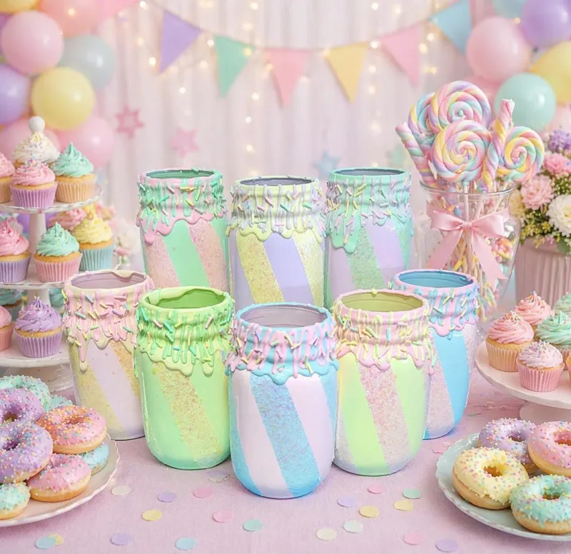
Photo: colorful sprinkle mixes in glass jars on dessert party table, via i.etsystatic.com
Ask most home bakers how they pick sprinkles and you'll get the same answer: they open the pantry, see what's left in the jar, and hope for the best. But talk to a professional event stylist and you'll hear something entirely different. To them, the dessert table isn't an afterthought — it's the closing shot of the whole party, and every sprinkle is a casting decision.
The good news? You don't need a design degree to think this way. You just need to flip your usual process upside down.
Stop Matching the Cake. Start Matching the Room.
Here's the mistake almost everyone makes: they bake the cake first, then hunt for sprinkles that coordinate with the frosting. Event stylists work in reverse. The frosting is a given — vanilla buttercream is vanilla buttercream. The party is the variable.
Before you bake anything, answer three questions:
- What's the venue's color story? A backyard barbecue in July and a rented loft in December call for completely different palettes.
- What will the photos look like? Be honest — you're posting these. Clashing backgrounds will fight your dessert table in every frame.
- What's the emotional temperature? A retirement party and a first birthday might share a guest list but need totally different energy.
Once you know the mood, the sprinkle selection becomes a design exercise instead of a pantry scavenger hunt.
The 60-30-10 Rule, Sprinkle Edition
Interior designers swear by the 60-30-10 rule: 60% dominant color, 30% secondary, 10% accent. It translates beautifully to the dessert table.
For a sprinkle mix, that means your jar should roughly break down like this:
- 60% — your anchor color, usually a neutral: white pearls, gold dragees, clear sugar crystals
- 30% — your theme color: the blush pink for a shower, the forest green for a holiday table
- 10% — the wow factor: metallics, iridescents, or one wildly contrasting pop
That final 10% is what separates a homemade mix from a grocery-store blend. It's the detail people photograph without realizing why.
Palette Formulas That Actually Work
Need a shortcut? These combinations come straight from stylists who dress dessert tables for a living.
The Birthday Blowout: Bold doesn't mean chaotic. Pick two saturated hues (cobalt blue and tangerine is a crowd favorite) and temper them with white jimmies and silver stars. The neutral gives the eye somewhere to rest.
The Baby Shower Softie: Pastels go muddy fast when piled together. Limit yourself to two pastels max — sage and butter yellow is having a moment — then lean heavily on white chocolate pearls and translucent sugar for that soft-focus glow.
The Holiday Classic, Elevated: Skip the pre-mixed red-and-green jar. Instead, pair a deep cranberry nonpareil with champagne gold and just a whisper of evergreen. It reads festive without looking like a craft store exploded.
The Grown-Up Gathering: For dinner parties and milestone birthdays, monochrome is your friend. All-white sprinkles on dark chocolate ganache is minimalist, dramatic, and shockingly easy.
Let the Season Do the Styling
When you're stuck, borrow from nature's palette. Autumn practically styles itself — burnt orange, cream, and copper shimmer. Spring wants pale lilac and mint against vanilla. Summer can handle neon and citrus brights because the sunlight does half the work. Winter is the season to go heavy on metallics; gold and silver catch candlelight like nothing else.
The trick is restraint. Seasonal palettes fail when every seasonal color shows up at once. Pick three, maybe four, and stop there.
A Few Practical Warnings From the Pros
Stylists shared a couple of hard-earned lessons worth stealing:
- Test on the actual frosting. Sprinkles look different against white buttercream than they do in the jar — and completely different again on chocolate.
- Beware the bleeding nonpareil. Cheap versions can leach color into frosting within hours. Do a test dab the night before if the color matters.
- Match your vessel. A gorgeous mix displayed in a clashing bowl loses its magic. Clear glass or simple white ceramic lets the colors speak.
- Edit ruthlessly. Five well-chosen sprinkle types beat fifteen random ones. Every time.
The Takeaway
Sprinkles are the cheapest styling tool in your entire kitchen. A four-dollar jar can pull a whole dessert table into coherence — if you choose it with intention. So next time you're planning a party, don't ask what matches the frosting. Ask what matches the moment. Your guests may never articulate why the table felt so put-together. But they'll feel it — and your camera roll will prove it.